
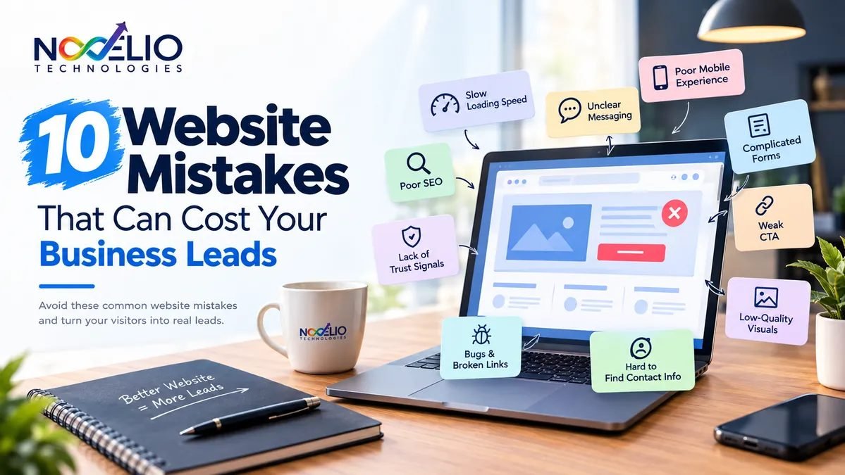
10 Website Mistakes That Can Cost Your Business Leads
Website Mistakes Lead Generation Conversion Web Development Small Business
The short version: if your website gets visitors but few enquiries, more traffic is rarely the fix. Unclear messaging, missing proof, slow pages, and hard-to-use forms quietly stop people at each step between landing on your site and contacting you. These ten mistakes are the ones worth checking first.
You are getting website visitors. But they are not calling, requesting a quote, booking a consultation, or buying.
The natural reaction is to think: “We need more traffic.” But traffic may not be the real problem. Your website could already be losing potential customers.
A confusing headline can make someone leave before understanding what you do. Missing proof can make them hesitate. A slow page can frustrate them. And when they are finally ready to contact you, a complicated form or weak call to action can stop them.
These small website mistakes often go unnoticed because nothing appears obviously broken. But together, they can quietly cost your business leads.
A good business website should help a visitor move through a simple journey:
If any one of these steps becomes difficult, a potential customer may leave and choose another business. Here are 10 website mistakes worth checking.
Table of Contents
- 1. Visitors Cannot Understand What You Do Quickly
- 2. There Is No Clear Next Step
- 3. Your Important Pages Are Too Slow
- 4. Your Mobile Experience Makes Conversion Harder
- 5. Your Navigation and Page Structure Are Confusing
- 6. You Do Not Give Visitors Enough Reason to Trust You
- 7. Your Service Pages Do Not Answer Buying Questions
- 8. Your Contact Process Creates Unnecessary Friction
- 9. Your Content Attracts the Wrong Search Intent
- 10. You Measure Traffic Instead of Lead Generation
- How to Find the Biggest Lead Leaks on Your Website
- What a Lead-Generating Website Should Actually Do
- FAQs
1. Visitors Cannot Understand What You Do Quickly
When someone lands on your homepage, they should understand your business within a few seconds. They should be able to answer three basic questions:
- What do you offer?
- Who is it for?
- Why should I care?
Many websites use headlines such as “Building Better Experiences,” “Solutions That Move You Forward,” or “Quality You Can Trust.” They may sound professional, but they do not clearly explain the business.
A visitor should not have to scroll through half the homepage to understand what you actually do.
What to Check
Show your homepage to someone who does not know your company and ask them: “What does this business do?” If they cannot answer quickly, your messaging probably needs work.
2. There Is No Clear Next Step
A visitor understands your business. Now what? Should they call? Request a quote? Book a consultation? Fill out a form? View your services?
If the next step is not obvious, people often do nothing. This is one of the most common website mistakes.
Every important page should have a clear purpose and a clear call to action. For example:
- A service page might say Request a Quote.
- A consulting business might use Schedule a Consultation.
- A local service company might use Call Now.
- An educational article may guide the reader to Learn More About This Service.
The important thing is not to place ten different calls to action everywhere. Give the visitor one logical next step. Our guide to building a high-converting landing page covers how to structure a page around that single action.
3. Your Important Pages Are Too Slow
Visitors do not care why your website is slow. They simply experience the delay.
Large images, unnecessary scripts, third-party tools, videos, plugins, tracking tools, and inefficient code can all affect performance. You do not necessarily need to optimize every page first. Start with the pages that matter most:
- Homepage
- Main service pages
- Landing pages
- Contact page
- High-traffic pages
Compress large images. Remove unnecessary scripts. Review third-party tools. Test important pages on both desktop and mobile.
The goal is not to chase a perfect technical score. The goal is to give visitors a fast and stable experience so they can understand your business and take action without unnecessary delay.
4. Your Mobile Experience Makes Conversion Harder
A website looking good on a desktop does not mean it works well on a phone. And for many businesses, a large percentage of visitors may be coming from mobile devices. Common mobile problems include:
- Text that is too small
- Buttons placed too close together
- Complicated menus
- Forms that are difficult to complete
- Pop-ups covering important content
- Phone numbers that cannot be tapped
- Slow loading pages
- Important information pushed too far down
The best way to test your mobile website is simple: use it like a customer. Open your website on your phone and try to:
- Understand the business.
- Find a service.
- Read the page.
- Tap the main CTA.
- Call the business.
- Submit the contact form.
If any of these steps feels frustrating, your customers may feel the same way.
5. Your Navigation and Page Structure Are Confusing
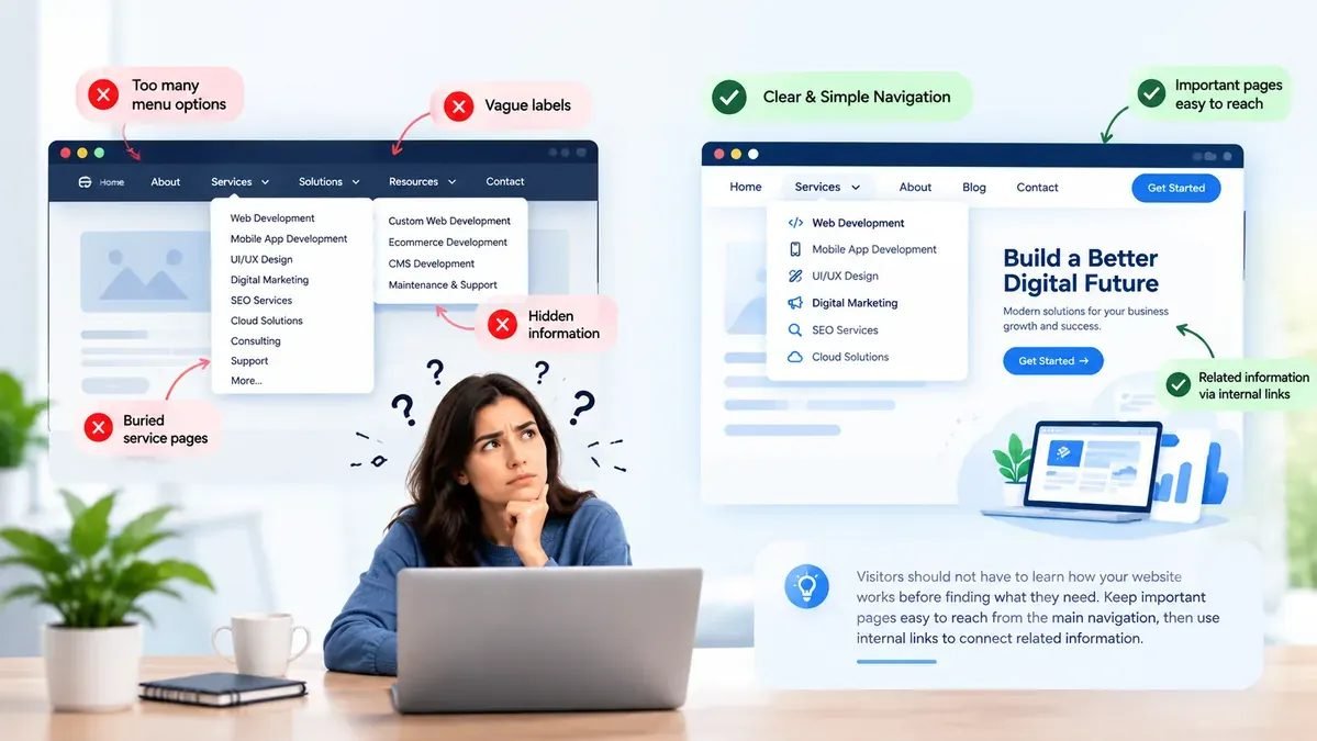
Your website should not feel like a puzzle. Visitors should be able to quickly find:
- Services
- About information
- Contact details
- Pricing information, where appropriate
- Locations
- Frequently asked questions
- Useful resources
Complicated navigation can make people give up. Avoid menus filled with too many options or vague labels. Simple labels usually work better: Services, About, Projects, Resources, Contact.
Also use internal links naturally. For example, someone reading an article about website performance should be able to discover your website development services without having to return to the homepage and search again.
Make the next useful page easy to find.
6. You Do Not Give Visitors Enough Reason to Trust You
People rarely contact a business just because the website looks good. They want reassurance. They want to know: can I trust this company?
Claims such as “experienced,” “professional,” “trusted,” “high quality,” and “customer focused” do not prove much by themselves. Anyone can write them.
Trust comes from evidence. That may include:
- Customer reviews and testimonials
- Case studies and project examples
- Before-and-after examples
- Certifications
- Client logos
- Years in business
- Team information
- Clear contact details and a real business address
- Guarantees or service commitments where appropriate
The placement also matters. A strong testimonial beside a service or contact CTA may have more impact than twenty reviews hidden on a separate page.
7. Your Service Pages Do Not Answer Buying Questions
Many business websites have service pages that look like this: a service name, one short paragraph, a few bullet points, then “Contact Us.” That may not be enough.
A potential customer usually has questions before contacting you. They may want to know:
- What exactly is included?
- Who is this service for?
- What problem does it solve?
- How does the process work?
- How long does it take?
- What makes your approach different?
- What happens after I contact you?
Your service page should help answer these questions. That does not mean writing thousands of unnecessary words. It means providing enough useful information for someone to feel comfortable taking the next step.
A good service page should reduce uncertainty.
8. Your Contact Process Creates Unnecessary Friction
Someone reaches your contact page. That is good news: they are interested. Do not make the final step difficult.
Long forms can create unnecessary friction. Do you really need ten or fifteen fields before speaking with a potential customer? Probably not. Start with the information you actually need. For many businesses, that may simply be:
- Name
- Phone
- Service required
- Short message
You can collect more details later. Also check the basics.
Ask Yourself
- Does the form work properly?
- Does it work on mobile?
- Is the phone number clickable?
- Is the CTA easy to see?
- Does the enquiry reach the correct person?
- Does the visitor receive confirmation?
- Do they know what happens next?
A person who is ready to contact you should not have to work hard to do it.
9. Your Content Attracts the Wrong Search Intent
More website traffic does not automatically mean more business. You could get thousands of visitors who were never likely to become customers. The question is: are the right people finding you?
Customers search in different ways. They may search for:
- A specific service
- A problem they need solved
- Cost or pricing information
- Comparisons
- Local providers
- Reviews
- How-to information
- A specific question
Your content should match what the customer is actually trying to find. For example, a business selling website services should not only publish general articles about web design. It may also need content around questions such as:
- How much does a small business website cost?
- When should a website be redesigned?
- Why is my website not generating leads?
- How long does it take to build a business website?
- What should a service business website include?
Content should attract useful traffic and then guide visitors toward the next relevant step. A strong SEO strategy should connect visibility with business intent, not just search volume.
10. You Measure Traffic Instead of Lead Generation
Traffic numbers can look impressive without showing whether the website is helping the business. One page may attract thousands of visitors and generate few inquiries, while another page with less traffic could produce valuable calls or quote requests.
Track meaningful actions such as:
- Contact form submissions
- Phone clicks
- Quote requests
- Consultation bookings
- Important CTA interactions
Then connect conversions with the pages and traffic sources that generated them. This reveals which parts of the website contribute to real opportunities instead of focusing only on visitor volume. For the bigger picture of where each page fits, see where your website fits in your sales funnel.
How to Find the Biggest Lead Leaks on Your Website

You do not need to redesign everything at once. Start with your homepage, highest-value service pages, major landing pages, and contact page. Review each page through the customer journey: Understand → Explore → Trust → Decide → Contact.
Look for the biggest obstacle at each stage. If the message is unclear, improve the headline. If visitors cannot find a service, simplify navigation. If the page is slow, improve performance. If forms are abandoned, reduce unnecessary fields.
These website mistakes become easier to prioritize when you link them to specific conversion problems.
Want a quick read on your own website?
Answer six questions and get an instant score showing where your site is most likely leaking leads. Prefer a closer look? Ask us for a free audit and we will review it for you.
Check My WebsiteWhat a Lead-Generating Website Should Actually Do
A business website should not simply exist online. It should help move a potential customer closer to doing business with you. A strong website should make five things easy:
- Understand your offer. Visitors should quickly understand what you do.
- Find useful information. They should be able to explore your services without confusion.
- Trust your business. They should see proof that reduces uncertainty.
- Take the next step. Your calls to action should be clear.
- Complete the action. Calling, booking, requesting a quote, or submitting a form should be simple.
Website design, content, SEO, performance, analytics, and conversion strategy should work together. Because getting found is only the beginning.
Once someone visits your website, the website has another job: help turn that visitor into a real business opportunity. If you are not sure where yours is falling short, our free website audit is a reasonable first step.
FAQs
What are the most common website mistakes businesses make?
Common problems include unclear messaging, weak CTAs, slow pages, poor mobile usability, confusing navigation, weak trust signals, thin service pages, complicated forms, irrelevant content, and missing conversion tracking.
Why is my website getting traffic but not generating leads?
Visitors may leave because they do not understand the offer, cannot find useful information, do not see enough proof, encounter usability problems, or cannot easily contact the business.
How can I improve my website's lead generation?
Start with pages closest to conversion. Clarify the offer, strengthen CTAs, improve service content, simplify forms, improve mobile usability, add relevant proof, and track meaningful conversion actions.
Do I need a complete website redesign?
Not always. Some websites need a larger rebuild because structural or technical issues affect multiple pages. Others can improve through targeted changes to messaging, navigation, content, forms, CTAs, and performance.
What should I check first if my website is not generating leads?
Start with your homepage, key service pages, landing pages, and contact page. Check whether visitors understand the offer, find information, see trust signals, know the next step, and can complete it easily on mobile.
Can SEO increase leads from my website?
SEO can help bring more relevant visitors to your website, but rankings alone do not guarantee leads. The website also needs clear messaging, useful content, trust signals, strong calls to action, and an easy conversion process.